There’s a point, which may have already happened, when we will run out of potential album covers. Something like 75,000 albums are released each year, which means that there are 75,000 decisions made about what the cover of said albums will look like. Understandably, there have already been a lot of albums with artwork that seem to share significant amount of overlap.
We’ve selected 10 covers of album covers that look like they’re “covers” of other covers. Some covers seem like parodies, others seem like plagiarism. Of course, in some cases it is still unclear if we are dealing with copying and laziness or with coincidental look-a-likes, but all of the 10 combinations of album covers here are certainly covering other covers.

My Bloody Valentine: Glider (1990) and Bloc Party: Intimacy (2008)
Musically, Bloc Party’s third record Intimacy, which was released by the London band in 2008, managed to estrange a reasonable amount of fans of the British rock quartet. The cover of the record at least justified its name. Around 20 years ago, My Bloody Valentine must have had the same thought when they put the two tongues on the cover of their 1990 EP Glider, which featured the Irish band’s hit "Soon." It’s a slimy and slippery business, covering covers.
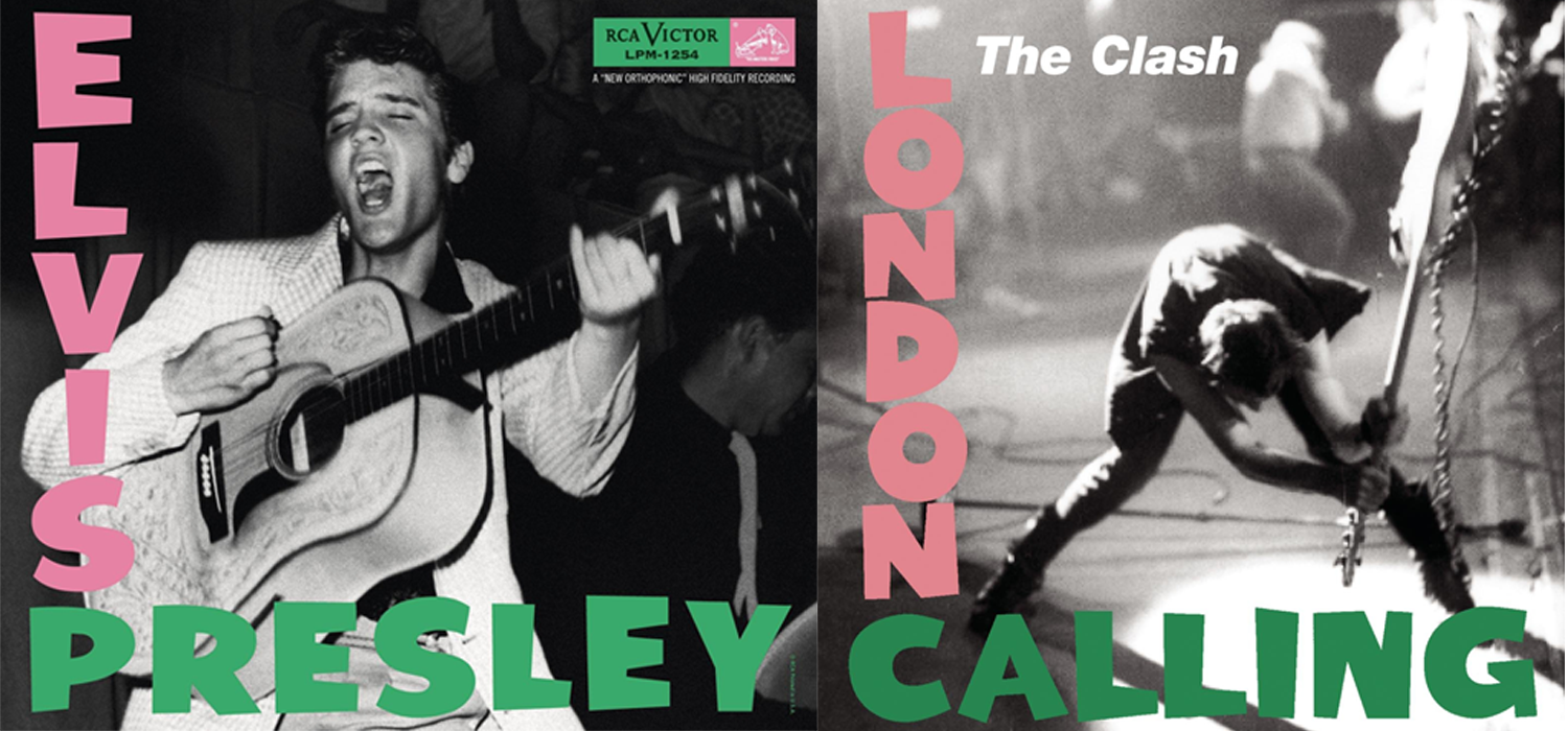
Elvis Presley: The Elvis Presley Album (1956) and The Clash: London Calling (1979)
Ah, The Clash’ London Calling, one of the most original and iconic album covers of all time, right? Turns out London was not the only thing that was on the phone. Elvis Presley called: He wants his album cover back. The King of Rock ’n’ Roll used the infamous combination of green and pink type on his 1956 record The Elvis Presley Album, some 20 years before his British colleagues used it on the sleeve of their finest moment. The cover was a conscious reference to Elvis, by the way, which showed the Clash wanted to revert to the purity of early rock ’n’ roll.

Gorillaz: Demon Days (2005) and The Beatles: Let It Be (1970)
The band whose album covers are covered the most? Probably the Beatles, as one would expect. The Brits who revolutionized the album cover industry with the designs of albums like Sgt. Pepper’s Lonely Hearts Club Band were repeatedly paid tribute to. A prime example is Gorillaz’ second record Demon Days. The 2005 full length features the creatures created by visual artists and band member Jamie Hewlett for the project fronted by Blur singer Damon Albarn. While Let It Be was The Beatles’ last studio album, Demon Days has already been succeeded by other albums.

Nas: Illmatic (1994) and Howard Hanger Trio: A Child Is Born (1974)
Nas’ Illmatic is without a doubt one of the most iconic albums in the history of hip-hop. Illmatic inspired a generation of rappers. However, when it comes to the immediately recognizable artwork of the album, Nasir Bin Olu Dara Jones was inspired by the past himself. As his father was an active musician in his young years, it’s highly likely he’s the reason why Nas came across A Child Is Born, a 1974 record by jazz three-piece Howard Hanger Trio.

Milemarker: Non Plus Ultra (1998) and Johnny Cash: At Folsom Prison (1968)
When it came to the design of the artwork of their 1998 release Non Plus Ultra, the members of Milemarker didn’t waste a drip of sweat. They just used Johnny Cash’s instead. Their cover of the album basically is a zoomed in version of the legendary singer’s live album At Folsom Prison, which was released in 1968 as the 27th Johnny Cash record. After his 1955 song Folsom Prison Blues, Cash had been wanting to perform a show at a prison, but his idea was not carried out until 1967. Eventually, At Folsom Prison was responsible for turning Cash’s career around after a period of limited success.

Joy Division: Unknown Pleasures (1979) and Nils Frahm: Solo (2015)
The iconic artwork of Joy Division’s sensational Unknown Pleasures has been printed on expensive T-shirts that are worn by people who don’t know Joy Division is a band, mugs and… on other albums. German composer and musician Nils Frahm, known for combining classical and electronic music and collaborating with Ólafur Arnalds and others, featured a variation on the Peter Saville design on his appositely titled solo record Solo, which was released through London label Erased Tapes.
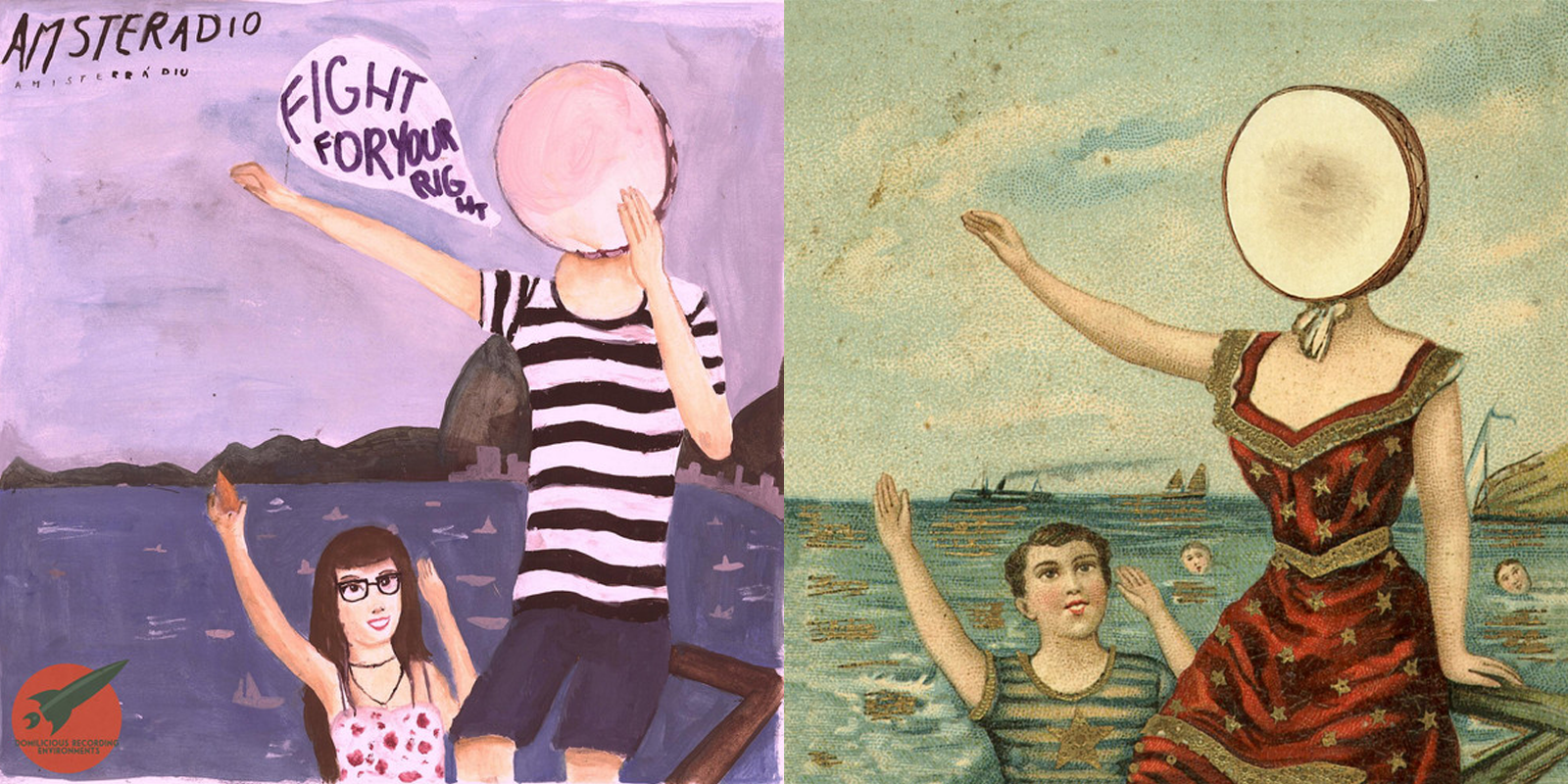
Amsteradio: Fight For Your Right (To Samba) (2014) and Neutral Milk Hotel: In The Aeroplane Over The Sea (1998)
Quite refreshingly, Brazilian lo-fi band Amsteradio were the first to admit the artwork of Fight For Your Right (To Samba), their first – and to this date – only full length, is an homage to the cover of Neutral Milk Hotel’s classic 1998 album In The Aeroplane Over The Sea. The Rio de Janeiro three piece then bizarrely tweeted Neutral Milk Hotel’s music made them want to start a very large fight (for their right to samba) in a very small Irish pub. In The Aeroplane Over The Sea also stirs up some feelings in us, but that particular urge, we’ve not felt to this date.

Franz Ferdinand: You Could Have It So Much Better (2005) and Tango: Tango (1973)
They could have had it so much better, but when it came to the production of the artwork for their second full length, Scottish indie rockers Franz Ferdinand chose the easy way out. The cover of You Could Have It So Much Better, the follow-up to the Glasgow quartet’s sensational debut record, is graced by an image that seems to have come straight from the eponymous first record of four-piece Tango, which was put out by A&M Records in 1973. The woman in the picture is even wearing the same hat.

Ambergris: Ambergris (1970) and Pavement: Watery, Domestic (1992)
Stephen Malkmus’ Pavement was one of the most sonically courageous indie rock bands of the nineties, but when the five piece had to design the artwork for their 1992 EP Watery, Domestic, they chickened out. Of course we always have quite a hard time telling two chickens apart, but we’re quite sure the animal on the Pavement cover is the same as the handsome hen on the sleeve of Ambergris’ eponymous debut from 1970. Even the white scribblings can’t hide that this cover is clearly a copy.

Ramones: Ramones (1976) and Nobunny: Love Visions (2008)
There have been very few bands that are as hard to get to pose for a picture as Ramones. The founders of punk rock had a reputation to live up to, and so they did. At first, the band members wanted the artwork of their 1976 debut record to look like the cover of Meet The Beatles, but the photoshoot, which was compared to pulling teeth, failed miserably. Eventually, a magazine photographer managed to get the four rascals together in one decent picture. Reportedly, the Ramones management paid him around $125 for the picture. We bet Nobunny was quite a lot easier to capture.
Related Articles
Join the Club!
Join Now, Starting at $44Exclusive 15% Off for Teachers, Students, Military members, Healthcare professionals & First Responders - Get Verified!
